Just released Agent 4.0.0, which features dedicated module configuration pages, a new Typing behavior page, and additional options on the Mouse key speed page.
I think it’s a huge release because even though the newly exposed options were available via smart macros, I’m sure many didn’t use them due to their relative lack of accessibility. Now, they’re super easy to use.
Things are already working well, but I’m curious about your feedback on how to make the user interface easier to comprehend. I don’t think major changes are needed, but rather smaller tweaks. Specifically, I think that some of the tooltips could be worded better. The information density of the new pages is quite high, so every little improvement helps, especially for newcomers.
Soon, I want to make a blog post about this release, but first, I’m waiting for your feedback.
As a last word, if you have smart macros manipulating the newly exposed settings, they’ll overwrite those settings, so make sure to delete the related smart macro commands.
Maybe add a tooltip next to the secondary roles header, saying something like:
Secondary role keys, also dual-role keys, are keys that act depending on context.
For instance, a key may act as an escape key when tapped alone, but act as a mouse layer switcher when used with another key (which is then executed in the mouse layer).
“Double tap to lock layer timeout” has wrong tooltip altogether. Suggested wording:
Double tap to lock layer timeout configures doubletap timeout for layer switchers, and also for the ifDoubletap macro condition.
“Double trap primary” typo. Also, it sounds a bit confusing, any ideas for improvement?
Keystroke delay, suggested ammend (last sentence was added):
Keystroke delay defines minimum delay between two consecutive usb reports, thus slowing down keyboard output in case of fast bursts (e.g., from the macro engine).
This improves compatibility as many programs (especially RDP clients) have problems accepting too fast input. On the flip side, this limits caret navigation mode sensitivity and introduces (possibly undesired) delays.
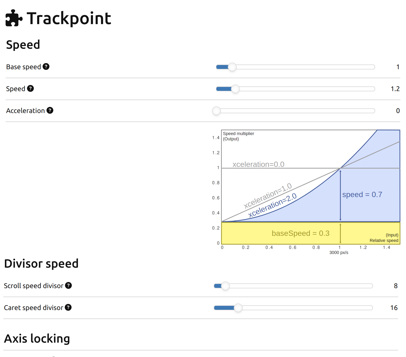
The speed diagram is missing entirelly from the module page. Also it may be the right time to introduce a dynamic graph that reacts to the sliders?
It may be nice to have a “reset to defaults” buttons?
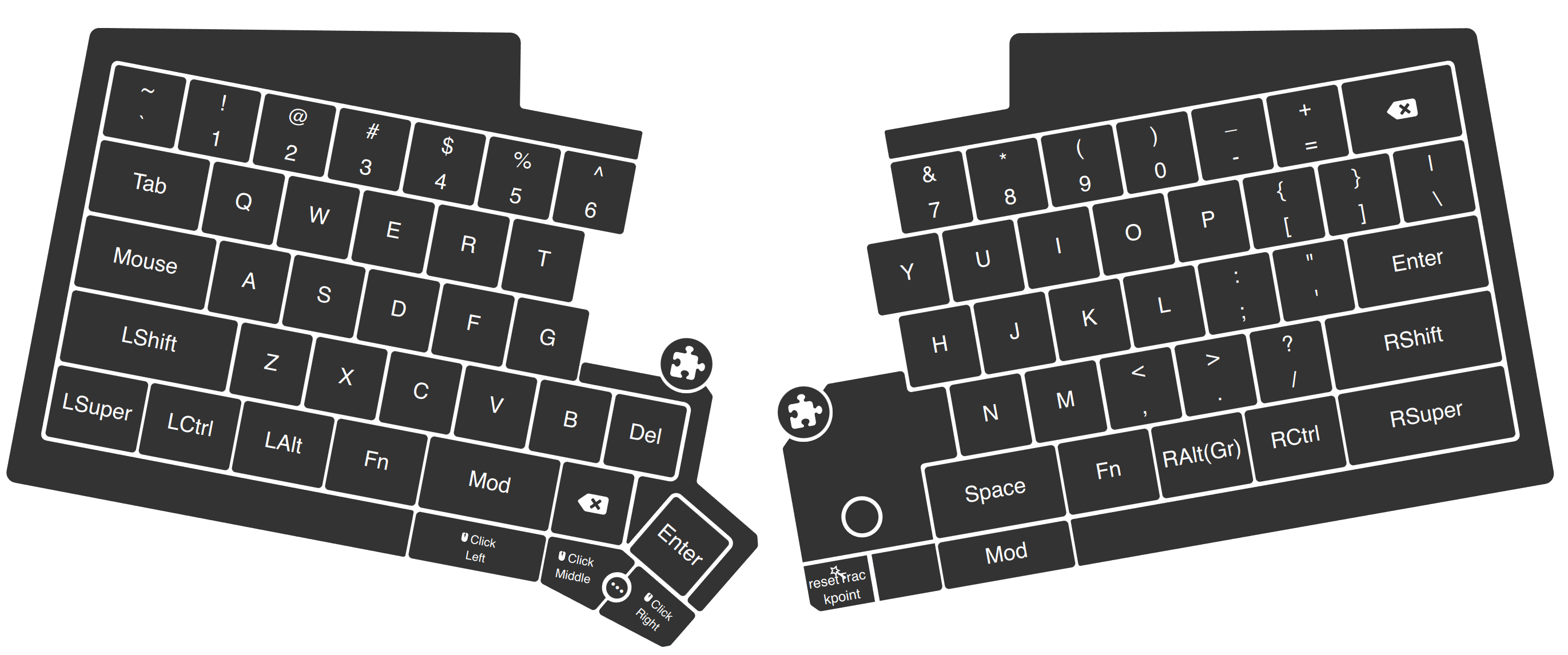
This looks oddly assymetric. I suggest placing the right icon farther to the right and slightly upwards:
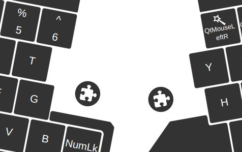
I find the puzzle icons to be cluttering the space. Also it is not where I would search for module config by default. I would remove them altogether and move the config pages into the left pane.
I think all configs (i.e., module config) should be available in the left pane.
Edit: I just now noticed that there is a new “modules” category in the left pane. Unfortunately, it is after macros, which means that for me it is out of visible area. It is also spacially far from other behavior configuration. As mentioned below, I suggest reorganizing the categories.
The “device” section in the left pane is quite cluttered / confusing. Personally I would split it into two sections:
I agree with your suggestions that I checked. Please make related commits or open an Agent issue for Robi.
I wouldn’t include smart macros for the sake of simplicity, especially regarding newcomers. I’d rather include this in the smart macro related part in the smart macro docs.
We can do it, but it’s not a priority. Please create an Agent issue for it.
I’m not against it, but maybe it’d be worth to wait to see if users are interested.
I think the puzzle icons are symmetric and useful.
I wouldn’t create a deeper category tree, but maybe moving the Modules menu directly below the Keymaps menu would make sense.
I wouldn’t include smart macros for the sake of simplicity, especially regarding newcomers. I’d rather include this in the smart macro related part in the smart macro docs.
Well, current tooltip belongs to secondary roles, so something has to be done about it.
I don’t think that intentionally providing incomplete and misleading information is a good idea. I think it should be cross referenced from both places. But do as you will.
We can do it, but it’s not a priority.
Indeed not a priority. So what about just sticking there the svg that already exists?
I wouldn’t create a deeper category tree, but maybe moving the Modules menu directly below the Keymaps menu would make sense.
Depth of the tree is not the point. The point is that current organization looks very arbitrary (arbitrary as in the word “random”, or as in “unorganized”).
If you don’t like deeper categories, than just flatenning modules sounds fine to me:
I agree with kareltucek about the left pane seeming a bit unorganized though. I feel like all the dynamic categories (Keymaps & Macros) would be better placed below the static sections. At the very least, the Modules section should be placed somewhere above Keymaps.
It would also seem better for the dynamic sections to be in the collapsed state when Agent is first opened, or maybe preserve the expanded/collapsed state when closing Agent. Another suggestion is to have the ability to create sub-sections for Macros and Keymaps. That would be extremely helpful for those of us with large lists to scroll through.
I’d like if the Touchpad “Hold continuation timeout” setting slider could be extended to at least two or more seconds as well.
I agree that the puzzle icons are confusing. If they open the module configuration, I would expect them to be “cog wheel” icons (). But then the keyboard itself should also have a cog wheel, because consistency…
Cog wheels have become the de-facto standard for settings:
The settings page also features a cog wheel icon leftward of its title. I feel like the cogwheel icon is too generic, and I’d prefer a more specific icon, preferably from Font Awesome.
I made the icons overlap each module with the intention to make it clear what they are referring to.
Also, once you click on any of the settings icons, and you get taken to the corresponding configuration section, how would you get back to where you were? These icons do not open a pop-up window, so you don’t automatically come back to the keyboard layout once you are done configuring. But I feel it would be good to have some kind of “back” functionality that takes you back to where you triggered the wrench button.
Should Agent have a stack (history) of recently visited pages, and a back button that walks back through that history?
It feels natural for me to start off on the layout, click a wrench icon, configure some settings, then go back to where I started (without having to hunt through several keymaps to find where I previously was.
Btw, I often feel similar when I add or edit a macro and then want to go back to the layout to add that macro to a key. Imagine I start at the layout and realise I want to check which macro I have on a key. So I click on a key and see the existing macro, but now realise I want to edit it. Would be great to be able to “edit this macro” (wrench icon?) and it would bring you to the macro. Once done, use “back” to go back to the keymap again.
If I hover over the (?) near the bottom, e.g. at “Invert horizontal scrolling”, the pop-up hover message shows up outside the usable area of the window, and the scroll bar expands. But I can’t scroll, because when I try to scroll the hover message disappears and the scroll bar shrinks again. So there is no way to actually see the hover message. I think at the bottom of the visible area hover messages should appear above the mouse cursor, not below.
Thanks for your mockups! Although I wouldn’t use colors other than the current gray color, I can see the merit of your design. I came up with the following overlapping icon design:
I don’t think featuring a settings icon on the right keyboard half is a good idea. You probably know that the right half is the master, and hence, it makes sense for you to feature a settings icon on it, but most people don’t know it, and featuring the keyboard settings icon on the right half would be confusing for them.
I doubt the usability of a general back button, and breadcrumbs feel overkill. But in some cases, a back/link functionality would be useful:
Featuring a “Back to QWERTY for PC keymap” link at the top of the module pages when coming from the relevant keymap
Featuring a “Back to QWERTY for PC keymap” link at the top of macro pages when coming from the relevant keymap. Clicking on this link would not only jump to the keymap but also to the layer and automatically open the key action popover, showing the macro from where the navigation started.
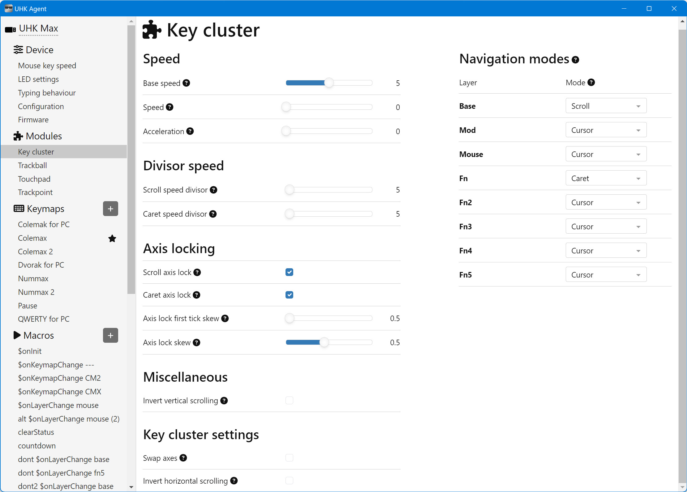
There are checkboxes in the Miscellaneous and “Key cluster settings” sections, but their contrast is so dim you probably couldn’t see them. We can make their contrast easier to see if this proves to be a common problem.
I have used the Agent again today, and the left menu is just really bad as it is. I am unclear why you @mlac are reluctant to restructure it as a whole, so here is the same proposal broken down into small pieces:
“Configuration” is too general and unclear. Let’s rename it to “Import/Export”
Let’s reorder the device items so that same kind of items are together. Same kind of items in this case is the “behavior configurations” group (Typing behavior and Mouse Key speed), and the “meta-technical” group (firmware flashing, import/export). (I am not sure where led configuration belongs, but I feel it to be more related to the latter.) (The items seem to be ordered randomly at the moment, so just reordering them does not disrupt anything?)
Bolder suggestion is to separate the above-mentioned into two separate categories. (I guess this is what causes the friction as to changes.)
If you can uncover the true reason why you don’t like the proposal, I would be happy to hear (and scrutinize) it.
An additional argument to do this now instead of later: we are adding new pages now, so it is a good time to get things right right from the beginning. If we release current state of affairs, people will get used to it, and any changes later will be perceived as being confusing just on basis of “Oh, they reorganized entire Agent again, I am lost.” and “every change is for worse” effects.
I agree with the general gist of @kareltucek about the structure of the left menu. But now I want to talk not about the structure of the menu but about the contents of some pages.
The module pages for Key cluster and Touchpad are weird. Obviously, the Agent page for each module contains the settings for that module. Now, for example, take a look at the Touchpad page:
The whole page are settings for the Touchpad. So why is there a section “Touchpad settings” at the bottom?
The same is true for the Key cluster.
I know that these sections are extras that the other modules do not have, and everything above are settings that every module has. But that’s a technical reason, not necessarily a good UI design choice.
One simple option would be to rename those bottom extra sections to something like “Additional settings”.
Or they should just get incorporated into the “Miscellaneous” section. That change would also make sense because at the moment “Invert vertical scrolling” is in the “Miscellaneous” section, but “Invert horizontal scrolling” is in the “Key cluster settings” section. That makes no sense.
Thus, rename “Miscellaneous” to “Scrolling direction” and combine all “Key cluster settings” into it (when looking at the Key cluster module).
For the Touchpad module, the “Scrolling direction” section would only contain “Invert vertical scrolling”, and the remaining settings (pinch-to-zoom and hold continuation) would be called “Additional behaviour”, “Extended behaviour”, or something similar.
(As to Invert horizontal scrolling, it would make sense to make it available for all modules, as it relates to the so called natural scrolling that our users have pointed out should be inverted in both axes, not just vertical one.)